Booth
Student Project
An event hosting app for college clubs
and communities.
Overview
Club and community events at universities can foster connections for college students. However, outdated event calendars and scattered information can make it challenging for students to discover new clubs and make connections in their community.
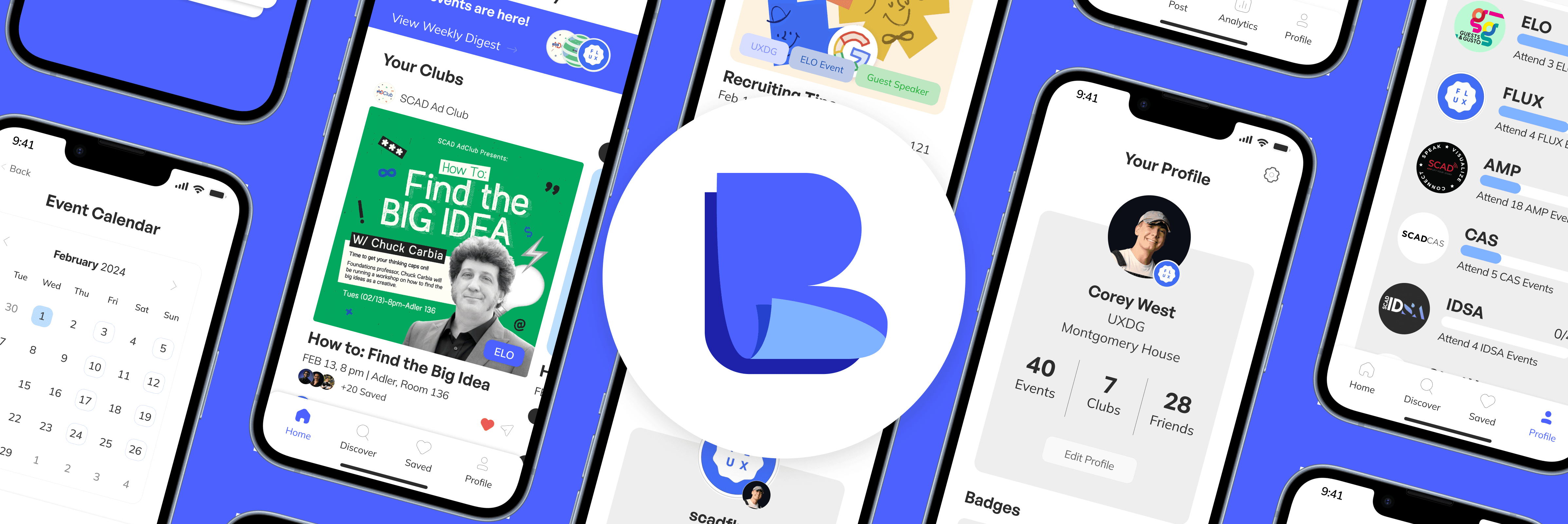
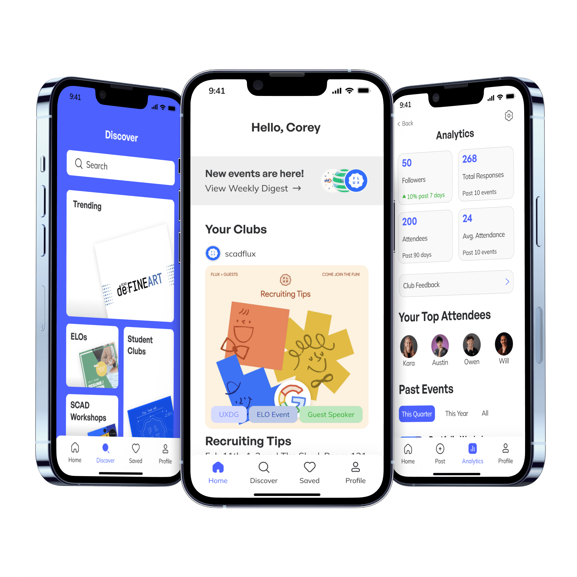
Booth gives a voice to campus clubs and residential communities, streamlining the event management process for hosts, while also giving students a cohesive platform to find and share campus events
My Roles
Project Manager: Made production timelines, tracking documentation, leading team meetings
UI Designer: Created sketches and wireframes, information architecture, prototyping interactions, creating design system
UX Researcher: Conducting secondary and primary research, writing testing scripts, implementing testing feedback
Duration
10 weeks
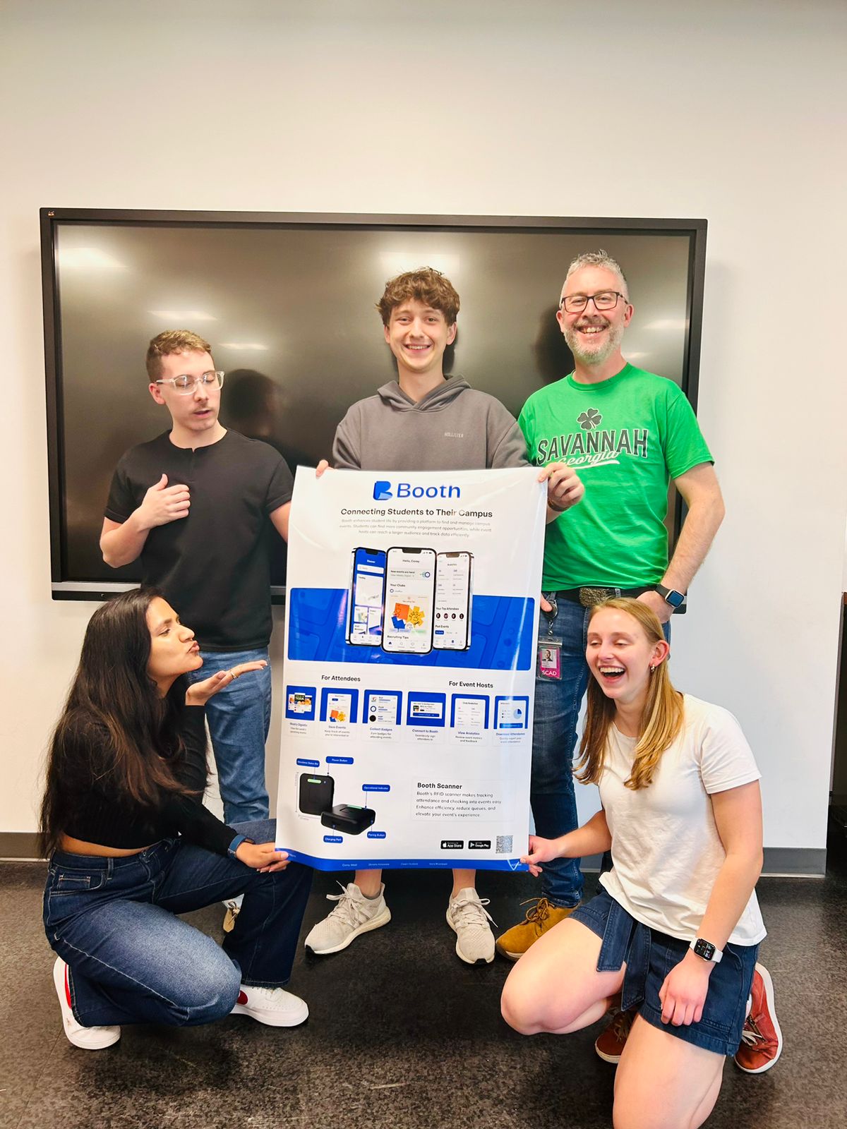
Team
Corey West
Kara Rivenbark
Divisha Kotawala
Tools
Figma
Rhino
Illustrator
Notion


Discovery
Exploring Our Problem Space
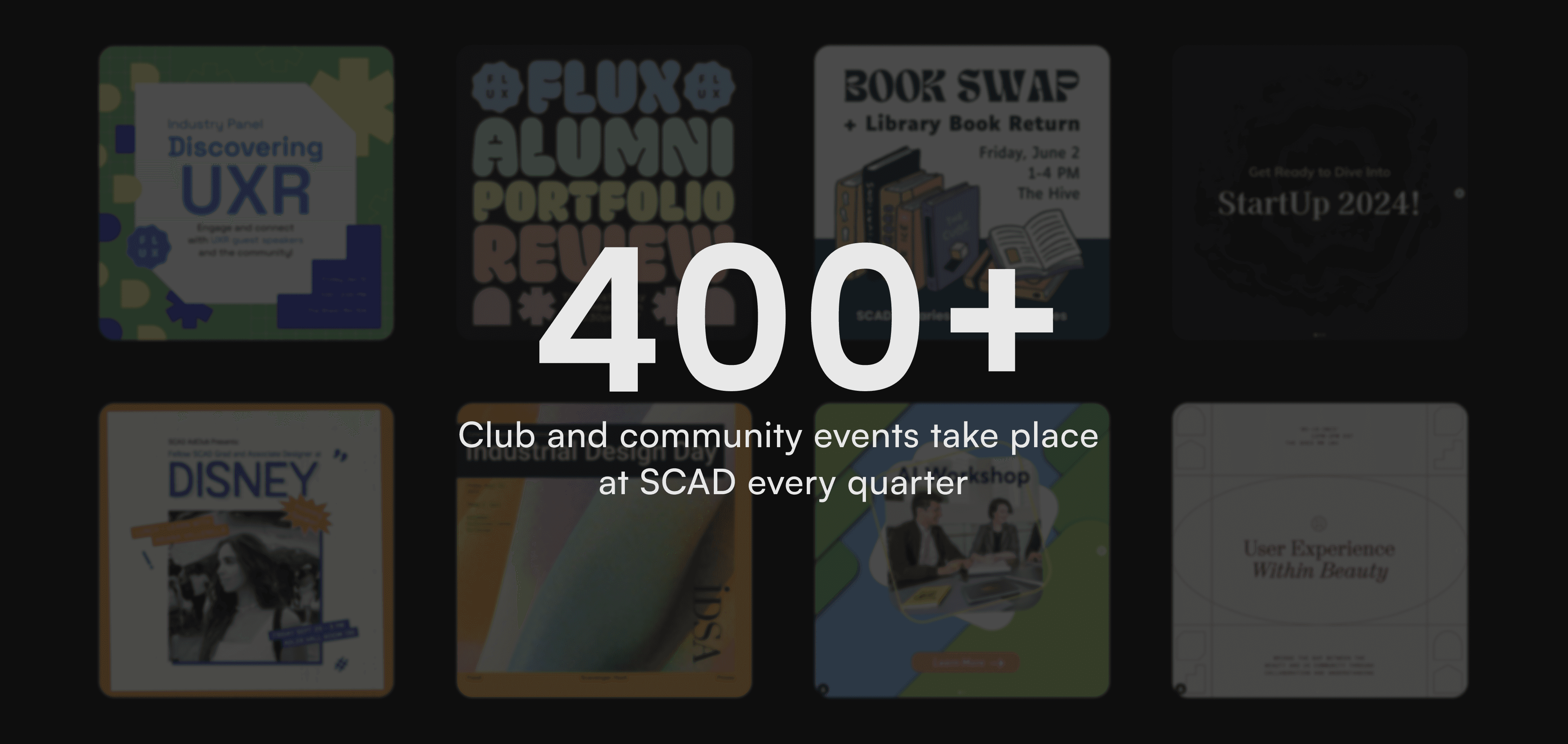
By the numbers
It was no question that on campus events were a big thing on our campus. After reaching out to friends from different universities, we found similar numbers.

Why is this important to us?
As a team full of students leaders (resident assistants & club officers), we found problems through the lens of both the students looking to attend events, and the students hosting and advertising events.
Research
How Might We…
Insights from both perspectives
To understand the full scope of our problem space, we conducted two research on two audiences: Attendees and hosts. To ensure that our product was widely applicable, We conducted our interviews and surveys in schools across the US and India.
Attendee Data
40+ students from SCAD and colleges in the US and India

Of our interviewees expressed frustration
in finding new events

Attendees reported various sources
for discovering and hearing about events.
Event Host Data
15 Club Officers, RAs, and Program Assistants

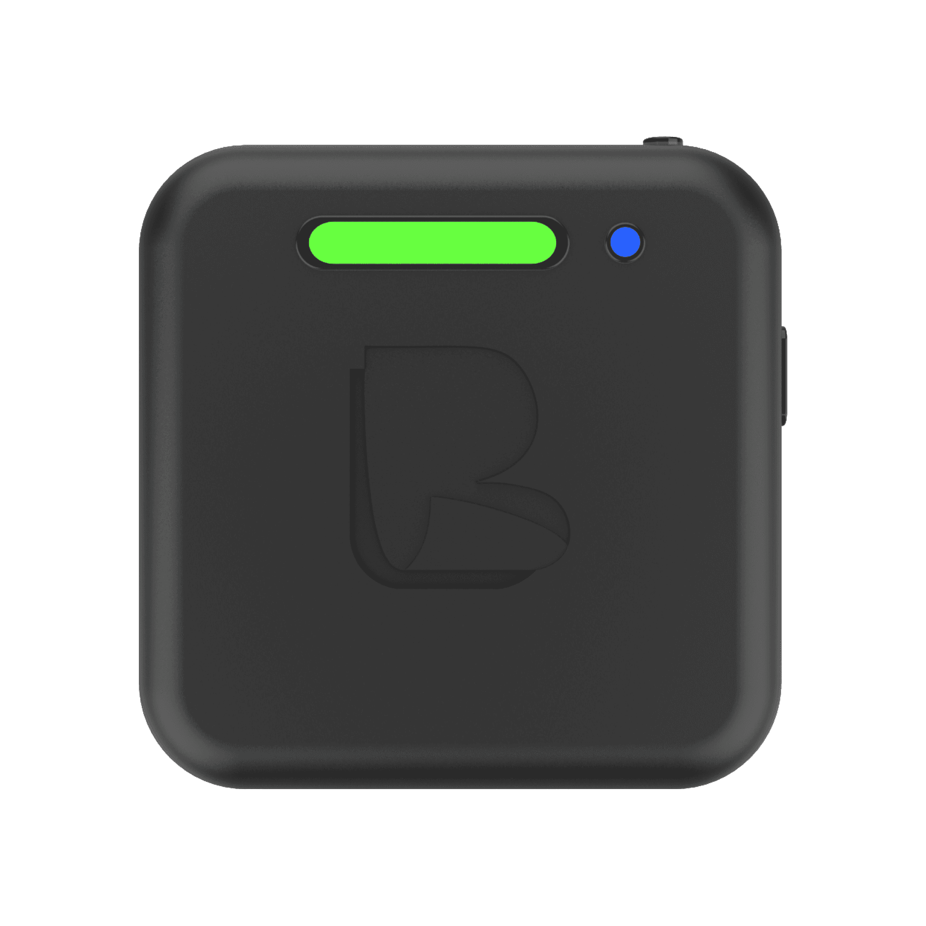
Feel tracking attendance is tedious,
difficult, and time-consuming.
Desire an automated system to track
attendance and measure analytics

From insights to actions
After compiling our user research, we took valuable insights and turned them into actionable steps towards building our app. These first steps served as the foundational building blocks of our product, assuring that all facets of our app were tied directly to the needs of our users.


Competitive Analysis
We conducted a competitive analysis on apps that focused on events and community building. Our findings helped guide us in refining our product’s functionality, organization, and design to ensure a distinctive and superior solution.


This analysis allowed us to better understand what user's expected when navigating an event finding app. We noted the strengths of each app and highlighted weaknesses that we could approve upon in our own design.
Design
Creating Booth
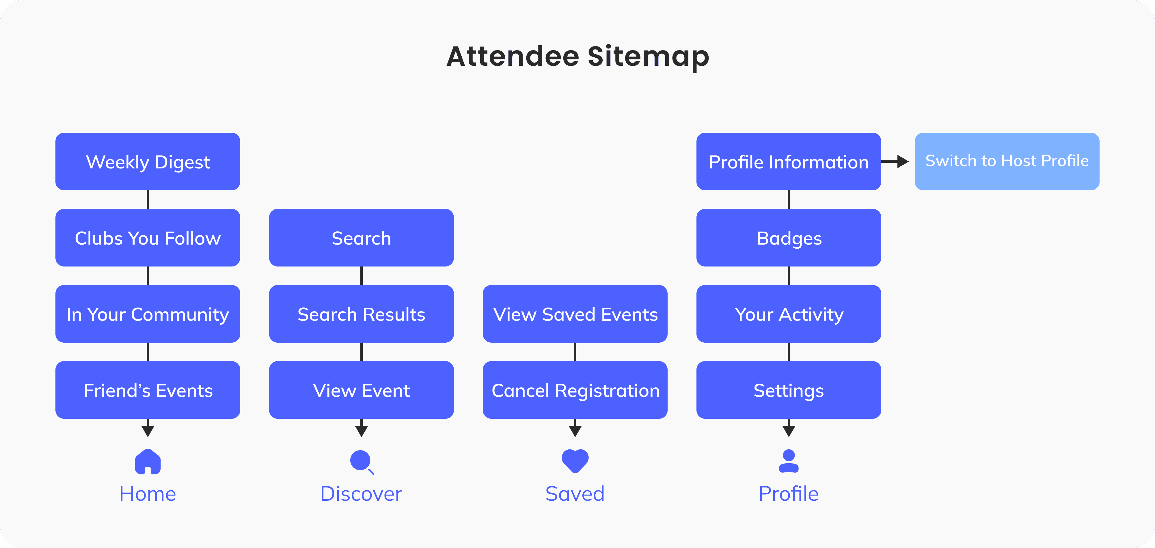
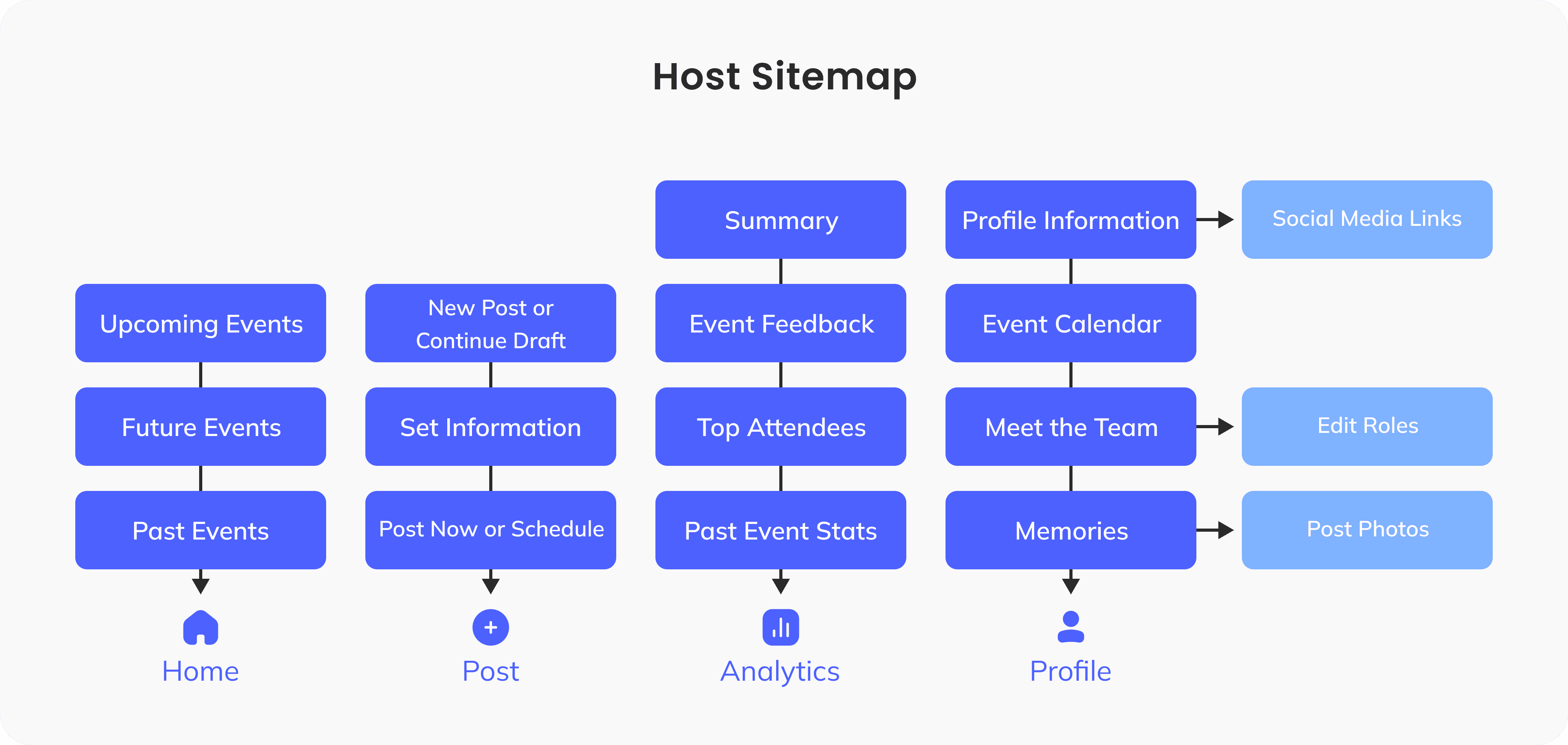
Sitemap and Functionality
We created a bottom-up sitemap for both attendee and host views, determining key interactions and content blocks. Our user data determined our priority screens and interactions.
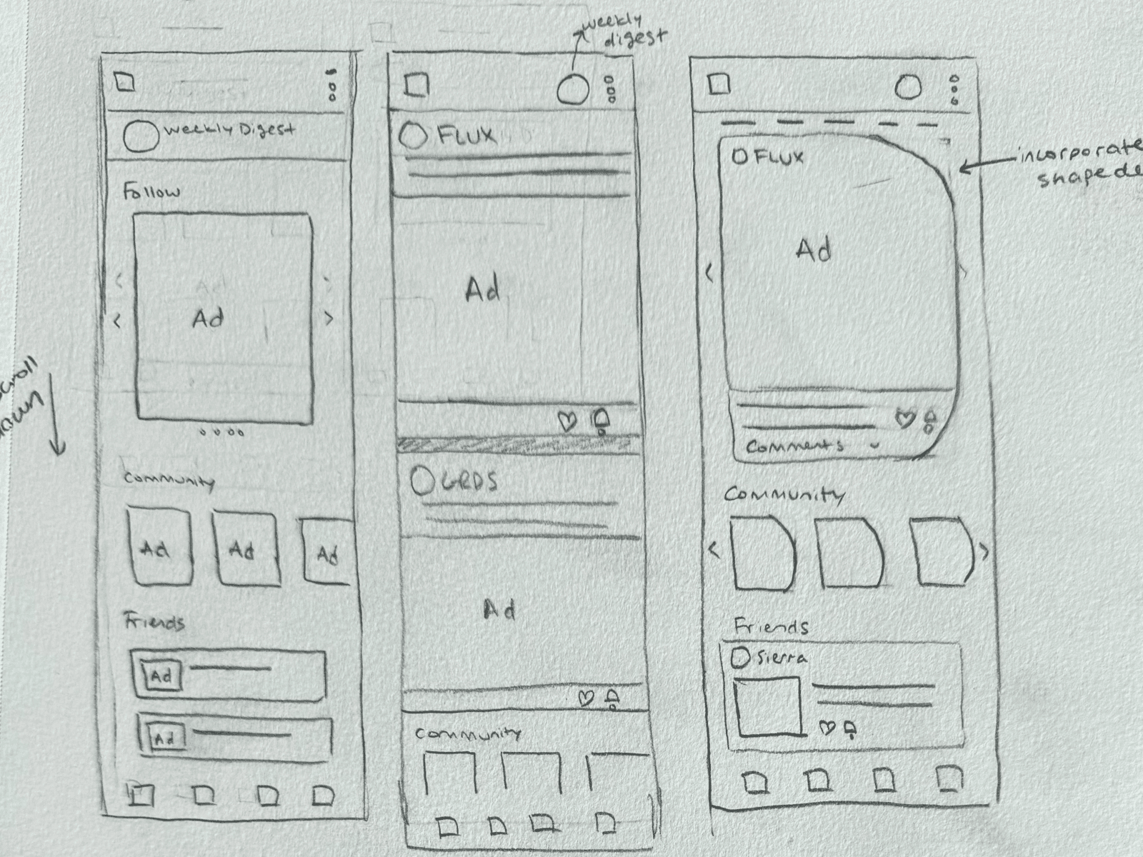
Design Fast, Iterate Faster
We started with crazy-8 sessions to sketch primary screens and interactions. From these sketches we moved to mid-fi screens, narrowing down our information architecture and copywriting.


Testing our designs
We conducted 3 rounds of user testing, assessing our user interface, information architecture, and primary task flows. AB Testing was utilized to test different layouts of information.

AB Testing: Event Cards
16 Respondents consisting of students and event hosts


AB testing also revealed that users wanted smaller cards for the host view and when viewing past events.
Test and repeat!
Our user testing rounds led to improvements in user flows, UI design, and copywriting. We prioritized solving critical problems and saved minor UI tweaks for hi-fi screen development.
Hi-Fi Development
Utilizing our branding guideline and atomic design system, we updated our mid-fi screens to high fidelity.


